The dashboard provides the functionality to view data stored in Machbase in chart format. It is offered in the form of a dashboard composed of multiple charts, with adjustable chart panel sizes and positions. Additionally, it supports an auto-refresh feature to periodically update data.
Starting Dashboard
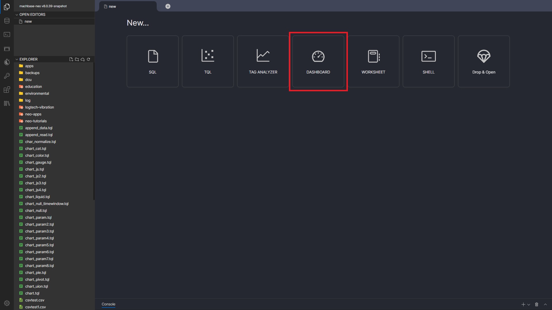
By clicking the “DASHBOARD” on the Machbase Neo home screen, you can create a new dashboard.
If you select a pre-created dashboard file (*.dsh) from the “EXPLORER” on the left side, you can view and edit the corresponding dashboard. View mode is provided using the link of a saved dashboard. (Please refer to the “Dashboard Control” section).
Dashboard
Screen Layout
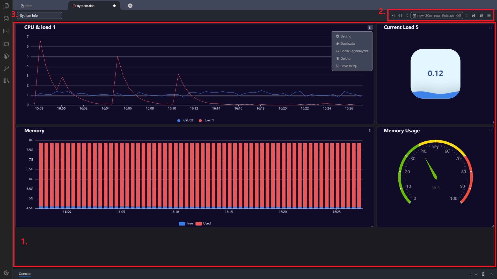
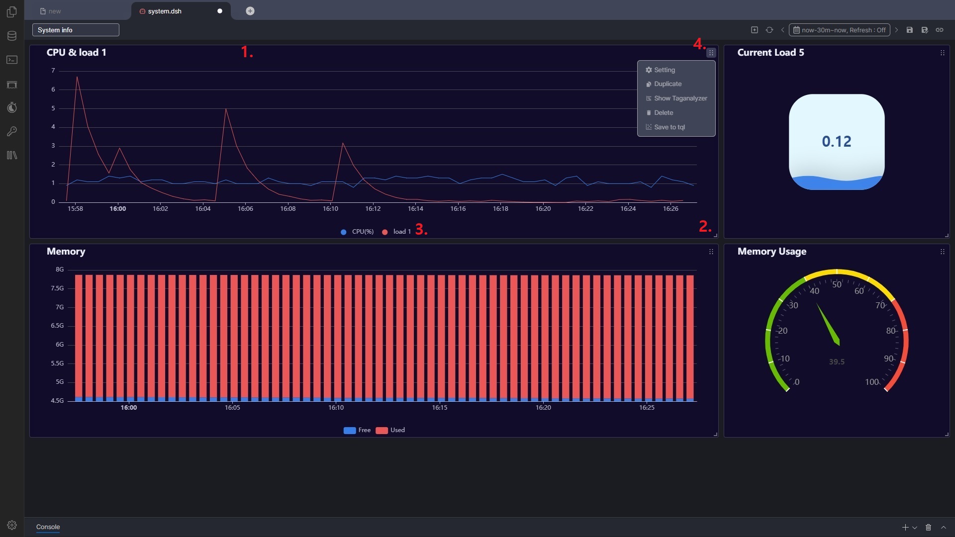
The dashboard consists of charts that display actual data. The size and position of each chart panel can be freely adjusted.
Area where the chart(s) are displayed
Title of the dashboard
Control area for managing the entire dashboard
Adding Charts
By clicking the [+] button in the dashboard control area, the screen switches to the chart settings. After setting the chart as desired and clicking the [Save] button, a chart panel is added to the dashboard. ※ Please refer to the “Chart Settings” section.
The newly added chart is placed with a default size. You can adjust the size by dragging the bottom-right corner of the panel and change its position by dragging the top of the panel.
Dashboard Control
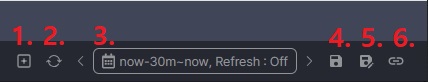
Time Range
Displays the time range applied to the dashboard. You can specify a fixed time range or configure it to sync with the current time. (‘now’ represents the current time, ‘h’ for hours, ‘m’ for minutes, ‘s’ for seconds) Example: now-3h = Current time minus 3 hours
Dashboard Control Buttons
Adds a new chart.
Reloads data and updates the charts.
Allows configuration of the time range for data queries.
You can use “now” or “last” for time ranges: now : Current time last : The last time of the data stored in the database
Clicking an item in the “Quick Range” sets the From/To time accordingly.
< or > buttons shift the specified time range by 50%. If “now” or “last” is used, they are converted to absolute times.
If a refresh interval is set, the dashboard will automatically redraw at the specified intervals.
Saves the current dashboard.
The file extension is ‘.dsh’.
For a new dashboard, you can specify a file name and folder.
Saves the dashboard with a new name.
Copies the link to the dashboard’s view mode to the clipboard.
This function is only available if the dashboard has been saved.
Login is required to access the dashboard in view mode.
In view mode, only time range adjustments and the refresh function are available.
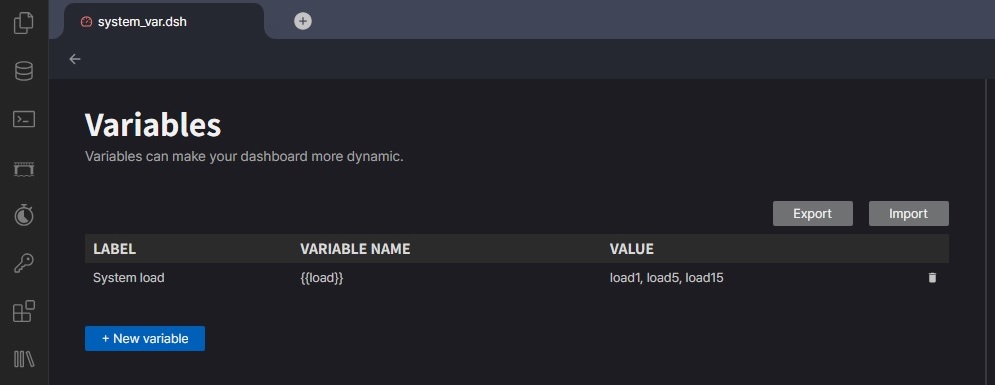
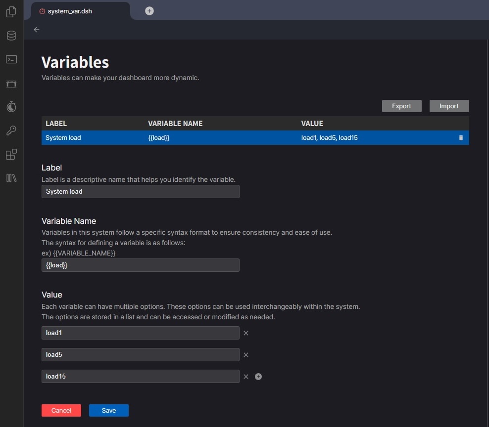
Set up variables.
Since v8.0.46 Define Variable You can view, add, edit, and delete variables set in the dashboard.
[+ New variable] : Create a new variable.
Label : Title of the variable input field.
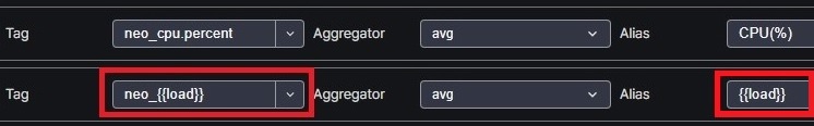
Variable Name : Variable name to use in Chart Setting. (It is recommended to define and use the format {{variable name}}.)
Value : Defines the optional items in the variable input field.
You can click on an existing variable to edit it.
[Export], [Import] : Export or import variables settings.
Using Variables
in Chart Settings In Chart Setting, enter the “Variable Name” in the section where you want to apply the variable.
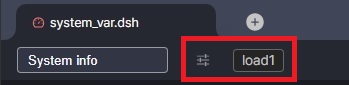
Changing variables in the dashboard
When you set up a variable, a variable input field appears next to the dashboard title.
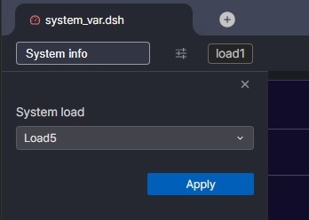
You can select a variable by clicking the variable input icon.
Chart Panel
Screen Layout
Drag Panel Header: Dragging the top of the panel allows you to change the position of the panel.
Resize Panel: Dragging the bottom-right corner of the panel allows you to adjust its size.
Toggle Legend: Clicking on a legend item toggles the corresponding series on or off.
Panel menu: Clicking the button in the top-right corner of the chart panel reveals a menu with the following options:
Setting : Modifies the chart settings. (Please refer to the “Chart Settings” section.)
Duplicate : Creates a new chart by copying the existing one.
Show Taganalyzer : Views the content of the current chart in the Tag Analyzer.
Delete : Removes the chart panel.
Save to tql : Saves the content of the chart as a TQL file.
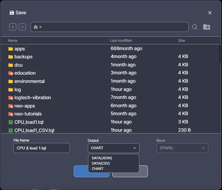
Save to TQL
The charts in the dashboard internally generate TQL to display the data. This function allows you to save the TQL used by the dashboard.
File Name : Specifies the name of the TQL file to be saved.
Output : Defines the type of TQL to save. DATA : TQL used to retrieve the required data. CHART : TQL used to render the corresponding chart.
Block : Used only when the output is set to DATA. Allows you to specify the Tag Name.
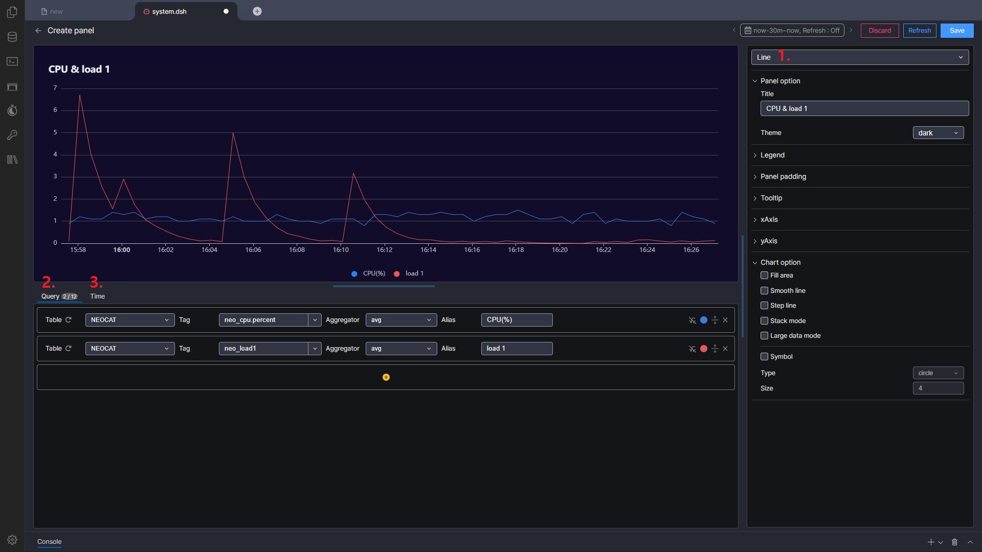
Chart Settings
Chart settings allow you to configure the detailed parameters of a chart.
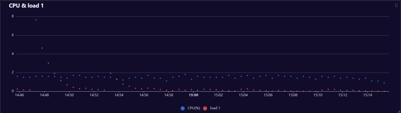
Chart Type Select the type of chart. The available configuration options depend on the chosen chart type.
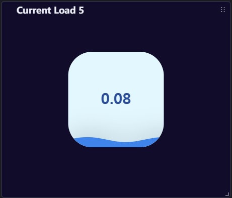
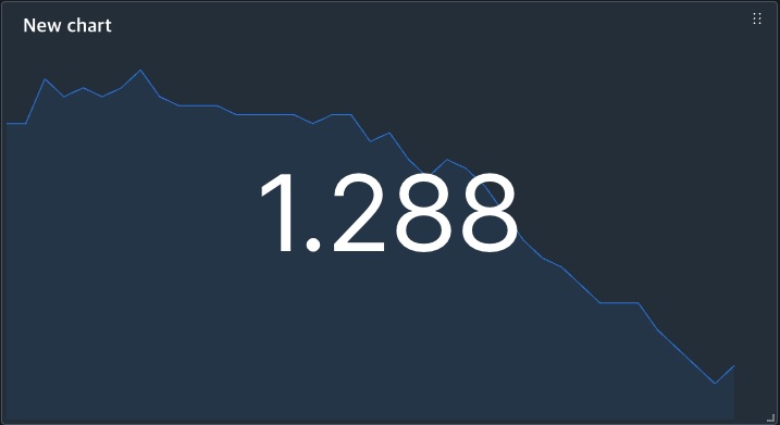
Chart Types : Line, Bar, Scatter, Gauge, Pie, Liquid Fill, TQL Chart ※ Please refer to the “Options by Chart Type” and “TQL chart” section.
Query Configure the data to be used in the chart. The input fields vary depending on the type of input mode, which are “Tag-Based Query Mode” and “Advanced Query Mode”.
Transform
Since v8.0.46 Calculate new data using the defined Query. (Please refer to the “Chart Settings > Transform Data” section.)
Time Use this option to specify a time range for the chart independently of the dashboard’s global time range. Functions the same as the dashboard’s time range settings but applies only to the specific chart, overriding the dashboard time range.
Tag-Based Query Mode
This feature can only be used with Tag Tables. Please refer to the image above.
Table : Specify the table name.
Tag : Enter or select the Tag Name to use.
Aggregator : Choose the aggregation function to apply based on the time interval of the x-axis. If ‘value’ is selected, raw data is used without aggregation. Options : value, sum, avg, min, max, count
Alias : Name to be displayed in the legend.
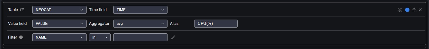
Advanced Query Mode
Allows specifying all query elements manually.
Table : Specify the table name.
Time Field : Select the column to use as the x-axis time value.
Value Field : Select the column to use as the y-axis value.
Aggregator : Aggregation function (same as in “Tag-Based Query Mode”).
Alias : Name to be displayed in the legend.
Filter : Input conditions to be used in the WHERE clause of the query. Multiple conditions can be entered, and they are combined using ’AND’.
Transform Data
You can calculate new data using the results of the defined Query.
Since v8.0.46
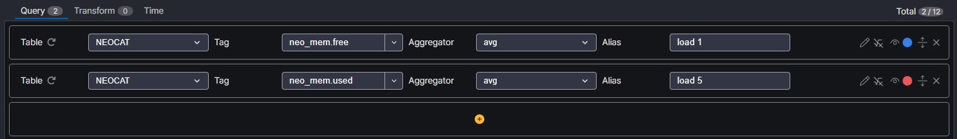
For example, the queries in the figure below, Two Queries are defined.
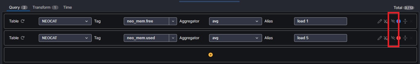
If you do not want to display the Query used for calculation on the chart, turn off the “Visible” icon as shown below.
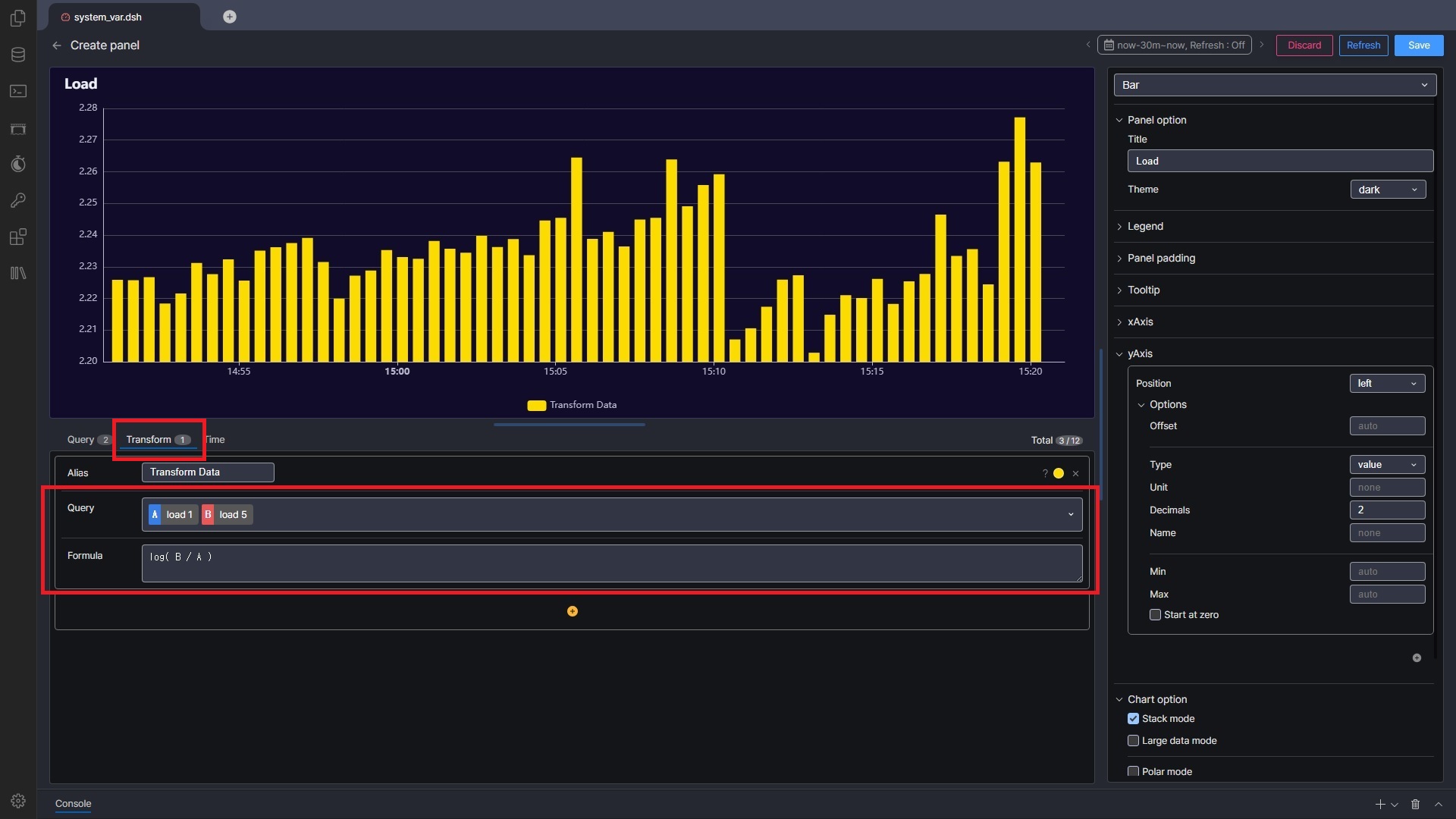
Change to the Transform tab, select the Queries you want to use for calculations, and enter the formula. When using Query in a formula, replace it with the alphabetic character displayed in front of the selected Query. ( e.g. log(B/A) )
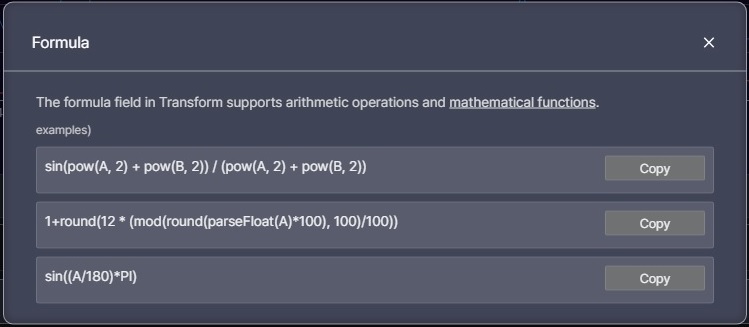
Brief help is available using the [?] button, and available math functions can be found under “Math” in “TQL > Utility Functions” in the left side menu. ※ Since it uses the query results to match the time and recalculate, it may be slower than using Query directly.
Control Function
a. Enter the query directly.
Since v8.0.46
The SELECT clause should be structured with Time(in milli seconds) followed by Value(a numerical number). e.g. SELECT TO_TIMESTAMP(TIME ROLLUP {{period_value}} {{period_unit}}) / 1000000 as TIME, avg(VALUE) as ‘Usage’
You can use both the predefined variables and the user-defined variables. (For predefined variables, please refer to the “TQL Chart Settings” section)
Brief help is available using the [?] icon.
b. Input a formula to process values extracted from the database (value = DB value) Example: value * 1.5
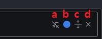
c. Choose whether to show the query in the chart.
Since v8.0.46
d. Assign a color to the chart.
e. Switch between “Advanced Query Mode” and “Tag-Based Query Mode”.
f. Remove the query.
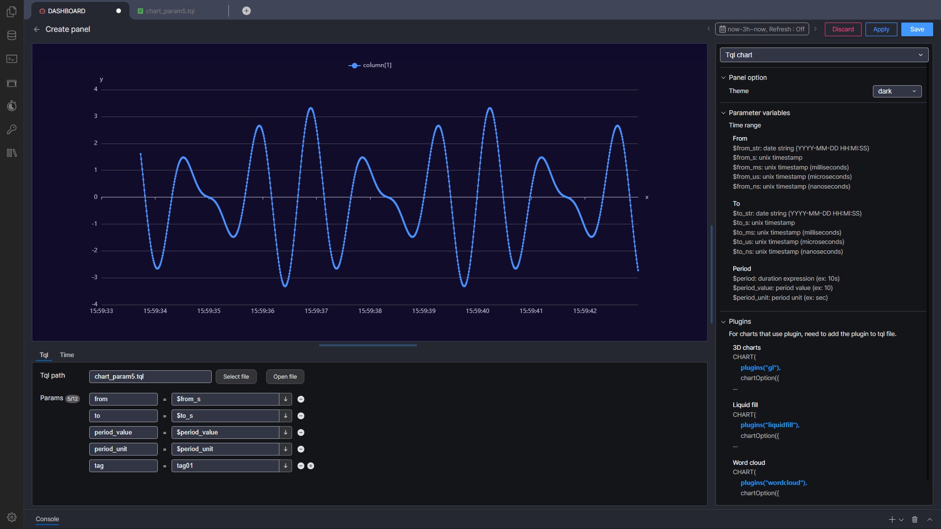
TQL chart
The “TQL Chart” type allows you to use custom TQL files in the dashboard. Only TQL files where the SINK function is set to “CHART” can be used.
TQL Chart Settings
Tql path : Select the TQL file to be used. Params : Register the parameters to pass to the TQL file. You can input values directly or use the predefined variables provided by Machbase Neo Dashboard. By default, the provided variables include Time Range and the x-axis time interval, which are explained in detail in the right panel.
Time range : It is used to synchronize the time with other chart panels in the dashboard.
Params
Desc
{{from_str}}
date string (YYYY-MM-DD HH:MI:SS)
{{from_s}},{{from_ms}},{{from_us}},{{from_ns}}
unix timestamp (milli, micro, nano)
{{to_str}}
date string (YYYY-MM-DD HH:MI:SS)
{{to_s}},{{to_ms}},{{to_us}},{{to_ns}}
unix timestamp (milli, micro, nano)
period : The time interval for the x-axis ticks, calculated based on the time range and panel size.
Params
Desc
{{period}}
duration expression (ex: 10s)
{{period_value}}
period value (ex: 10)
{{period_unit}}
period unit (ex: sec)
Applying Parameters in TQL Files
To use parameters in a TQL file for chart rendering, the param() function is used.
Executes a query where the parameters are dynamically applied using the param() and strSprintf() functions.
Parameters:
period_unit: Unit for the time interval (default : msec).
period_value: Interval value (default : 10).
from and to: Time range for the query.
tag: Specifies the tag to query (default : tag01).
CHART_LINE():
Uses the query result to render the chart as a line chart.
Options by Chart Type
Common Options
Panel option
Option
Desc
Title
The title displayed on the chart panel.
Theme
The theme of the chart. (Refer to the “TQL > CHART” section on left side menu)
Legend
Option
Desc
Show legend
Checkbox to toggle the display of the legend.
Vertical
Vertical position (top / center / bottom)
Horizontal
Horizontal position (left / center / right)
Alignment type
Alignment method (horizontal / vertical)
Panel padding Set the size of the margin between the panel border and the chart. ※ Space for the legend must be reserved by adjusting the padding settings.
Option
Desc
Top
Top margin
Bottom
Bottom margin
Left
Left margin
Right
Right margin
Tooltip
Option
Desc
Show tooltip
Checkbox to enable or disable the use of tooltips.
Type
Tooltip type (axis / item).
Unit
Unit displayed in the tooltip.
Decimals
Number of decimal places for the tooltip value.
xAxis
Option
Desc
Interval type
Unit of time intervals for the x-axis (none / sec / min / hour). ※ none = auto-calculated.
Interval value
Value of the time intervals for the x-axis.
yAxis ※ You can configure a dual Y-axis by pressing the [+] button.
Since v8.0.46Simply add a Y-axis and select the Series you want to use. The Options used are the same as the basic Y-axis.
Option
Desc
Position
Position of the Y-axis (left / right).
Offset
The gap between the axis line and the number.
Type
Type of Y-axis values.
- Unit
Unit of measurement.
- Decimals
Number of decimal places.
- Name
Name of the Y-axis (displayed at the top of the axis).
Min
Minimum value of the Y-axis.
Max
Maximum value of the Y-axis.
Start at zero
Y-axis always includes 0
Line
Chart option
Option
Desc
Fill area
Enable or disable the use of area fill. ※ Requires opacity setting (0 ~ 1).
Smooth line
Display lines smoothly.
Step line
Display lines in a step-like format.
Stack mode
Display lines in a stacked format.
Large data mode
Mode used when handling a large amount of data.
Symbol
Display symbols on values.
Symbol
Option
Desc
Type
Type of symbol (circle / rect / roundRect / triangle / diamond / pin / arrow).
Size
Size of the symbol.
Bar
Chart option
Option
Desc
Stack mode
Enable stack mode.
Large data mode
Mode used when handling a large amount of data.
Polar mode
Enable polar mode.
Polar mode
Option
Desc
Max
Maximum value.
Start angle
Starting angle of the Y-axis.
Radius
Inner radius (0: no inner circle).
Polar size
Outer radius (100: circle that fills the entire panel).
Polar axis
X-axis type (time / category).
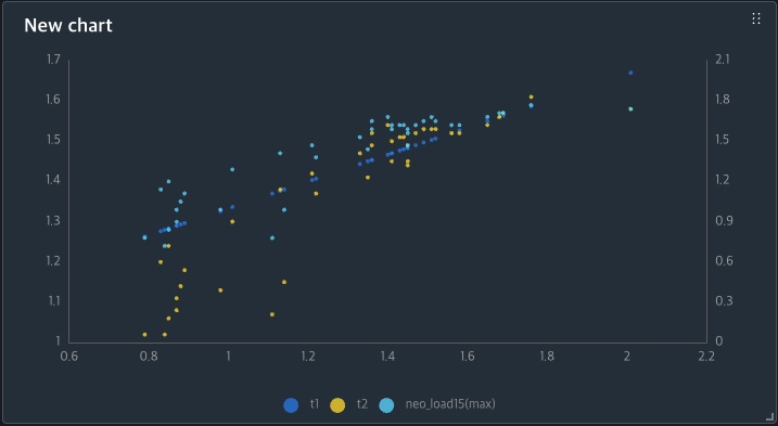
Scatter
Chart option
Option
Desc
Large data mode
Mode used when handling a large amount of data.
Symbol
Option
Desc
Type
Type of symbol (circle / rect / roundRect / triangle / diamond / pin / arrow).
Size
Size of the symbol.
Adv scatter
Since v8.0.46
xAxis
Option
Desc
Type
Type of X-axis values.
- Unit
Unit of measurement.
- Decimals
Number of decimal places.
Min
Minimum value of the X-axis.
Max
Maximum value of the X-axis.
Start at zero
X-axis always includes 0
Series
Select the Series to use as the X-axis. The first Query is selected by default.
Symbol
Option
Desc
Type
Type of symbol (circle / rect / roundRect / triangle / diamond / pin / arrow).
Size
Size of the symbol.
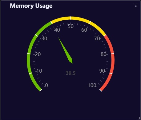
Gauge
Chart option
Option
Desc
Min
Minimum value.
Max
Maximum value.
Axis
Option
Desc
Label distance
Distance of the label from the line of the circle. (negative values are outside).
Show axis tick
Display axis ticks.
Setting line colors
Set colors based on values. (value range is specified as a ratio from 0 to 1).
Anchor
Option
Desc
Show anchor
Display the central circle.
Size
Size of the central circle.
Display value
Option
Desc
Font size
Font size of the value displayed inside the gauge.
Offset from center
Distance from the center.
Decimal places
Number of decimal places.
Active animation
Whether animation is applied.
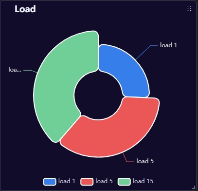
Pie
Chart option
Option
Desc
Doughnut ratio
Proportion of the inner circle (0-100).
Nightingale mode
Apply Nightingale mode (radius changes according to the values).