Chart Settings
Overview
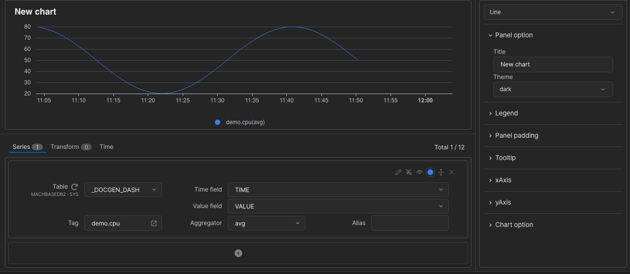
The chart settings screen has three areas.
- Preview — the chart drawn with the current settings.
- Series settings — tabs for the data to query (Series), calculations (Transform), and a range for this panel alone (Time or Distance).
- Chart options — the chart type and its display options.
Preview
Apply at the top right refreshes the preview, and Save adds the configured panel to the dashboard. Discard leaves without keeping the changes.
- Discard — closes the chart settings screen without saving.
- Apply — redraws the preview with the changed settings. When nothing has changed it reads Refresh and queries the data again.
- Save — adds a new panel to the dashboard, or applies the edits to an existing panel, and closes the screen.
Series Settings
Total n / 12 to the right of the tabs counts the Series and Transform items whose Visible icon is on. A panel can show up to 12.
Basic input
The default input for querying a TAG table.
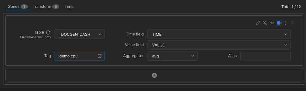
- Table — the table to query. The list shows
database · ownerunder each table name. A variable can be typed in directly as{{variable}}. For the Gauge, Pie and Liquid fill types the list also offers each TAG table’s per-tag statistics viewV$<TABLE>_STAT; pick a statistics column (ROW_COUNT,MIN_VALUE,MAX_VALUEand so on) as the Value field to show a tag’s row count, minimum or maximum. - Tag — the tag name to use. The
 icon on the right opens a tag search dialog.
 - Time field / Value field — the x-axis base column and the y-axis value column. If the value column is a JSON type, a JSON key selector appears so you can point at a path inside the JSON.
- Aggregator — the aggregation applied per x-axis interval:
value(raw data, no aggregation),sum,avg,min,max,count, plusdiff,diff (abs)anddiff (no-negative). - Alias — the name shown in the legend.
Detailed input (Expand)
The Expand  icon on a series row switches to an input where you specify value columns and conditions directly. Table and Time field work as in basic input.
- Value field — the value column. Each value has its own Aggregator and Alias; for the Geomap type, add more values with the
 icon.
icon. - Filter — WHERE conditions. Conditions added with the icon are combined with
AND, and the Typing icon on a condition row lets you type the condition directly.
 - Duration From / To — shown for LOG tables only. Shifts the start and end of the query range, in a form such as
-30sor+30s.
Tables other than TAG tables, such as LOG or VIEW tables, always use detailed input and cannot switch to basic input.
Typing SQL directly (Typing)
Since v8.0.46The Typing icon on a series row lets you write the whole query as SQL. It is available for the Line and Bar types only, and not while the Aggregator is one of the diff variants.
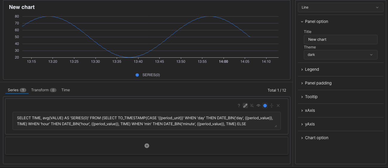
- The SELECT clause must produce the time (in milliseconds) followed by the value.
- Both the built-in variables (
{{period_value}},{{period_unit}}and others) and user-defined variables can be used. See “TQL Chart” for the list of built-in variables.
Series row icons

From left to right:
- Typing — switches to direct SQL entry. While typing it becomes Selecting, which switches back to selecting fields.
 Enter formula — a formula applied to the values read from the database (for example
 value * 1.5). Visible — whether this series is drawn on the chart. Turn it off for series used only in a calculation.
 Color — the colour of the series.
- Expand — switches to detailed input. While expanded it becomes Collapse, which switches back to basic input.
 Delete — removes the series.
Transform
Since v8.0.46Calculates new data from the series you defined. The tab appears for the Line, Bar, Scatter, Pie, Adv scatter, Liquid fill, Gauge and Text types. First define two or more series to calculate from.
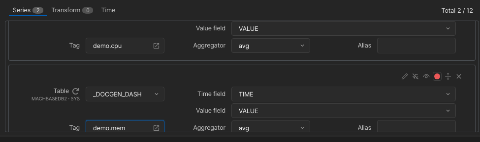
Then add a row on the Transform tab and write the formula.
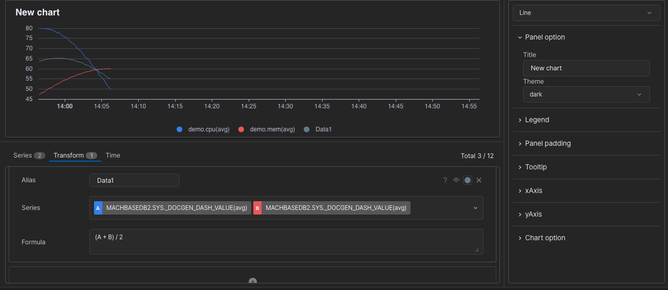
- Alias — the name of the resulting series.
- Series — the series used in the calculation.
- Formula — written with the letters shown in front of the selected series (for example
log(B/A)). - The
 icon shows brief help; the available math functions are listed under “TQL > Utility Functions” in the left menu.
A series produced by Transform is handled like any other series.
- Its Visible and Color icons on the right of the row set whether and in which colour it is drawn. Turn off Visible on the source series used only for the calculation to show just the result.
- It appears under its Alias wherever chart options pick a series (the yAxis Series, the Text Series and so on). If Alias is left empty it is named by position, such as
TRANSFORM_VALUE(0). - Transform results with Visible on also count toward
Total n / 12.
※ Because the series results are recalculated before drawing, this can be slower than a series without a calculation.
Time and Distance tabs
Set a query range and refresh interval for this panel alone. A panel that queries by distance shows a Distance tab instead of the Time tab. See the per-panel time and distance range in “Chart Panel” for details.
Chart Options
Choose the chart type at the top, then set the display options below it. Options that differ by type are described in “Options by Chart Type”.
The options below are shared by several chart types:
- Panel option — every type except TQL and Video
- Legend, Panel padding, Tooltip — every type except TQL, Video, Text and Geomap
- xAxis, yAxis — Line, Bar, Scatter and Adv scatter
Panel option
| Option | Desc |
|---|---|
| Title | The title displayed on the chart panel. For Geomap, the colour picker on the right also sets the title colour. |
| Theme | The chart theme (see “TQL > CHART” in the left menu) |
Legend
| Option | Desc |
|---|---|
| Show legend | Whether the legend is shown |
| Vertical | Vertical position (top / center / bottom) |
| Horizontal | Horizontal position (left / center / right) |
| Alignment type | Alignment (horizontal / vertical) |
Panel padding
The margin between the panel border and the chart. Reserve enough padding for the legend.
| Option | Desc |
|---|---|
| Top | Top margin |
| Bottom | Bottom margin |
| Left | Left margin |
| Right | Right margin |
Tooltip
| Option | Desc |
|---|---|
| Show tooltip | Whether tooltips are used |
| Type | Tooltip type (item / axis) |
| Unit | Unit shown in the tooltip |
| Decimals | Number of decimal places |
xAxis
| Option | Desc |
|---|---|
| Interval type | Unit of the x-axis interval: none / sec / min / hour on a time axis, none / value on a distance axis. none is calculated automatically. |
| Interval value | Value of the x-axis interval |
Panels that use a distance base axis, and Adv scatter, additionally show value-axis options (Unit · Decimals · Min · Max · Start at zero) under Options.
yAxis
Since v8.0.46| Option | Desc |
|---|---|
| Name | Name of the y-axis |
| Position | Position of the y-axis (left / right) |
| Offset | Distance, in pixels, to move the axis from its default position |
| Tick options | Unit, Decimals, Min, Max and Start at zero (always include 0) for the tick values |
| Thresholds | Add threshold adds a threshold line with a value and a colour. Several can be added. (Line / Bar / Scatter) |
The icon adds a second y-axis (two at most); choose the series it draws under that axis’s Series. Its options are the same as the default y-axis.