Noise Filters
Measuring sensors
The IoT data we can observe is composed of values measured through sensors. Every sensor inherently includes some degree of noise, which represents unavoidable errors. Data without any noise, in a purely theoretical sense, can only be mathematically generated as virtual data.
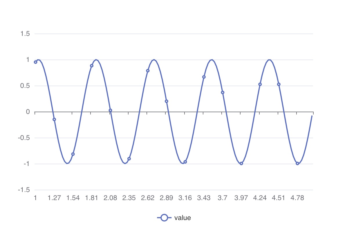
Generally, noise tends to be higher frequency than the data we intend to observe, as depicted in the graph below.
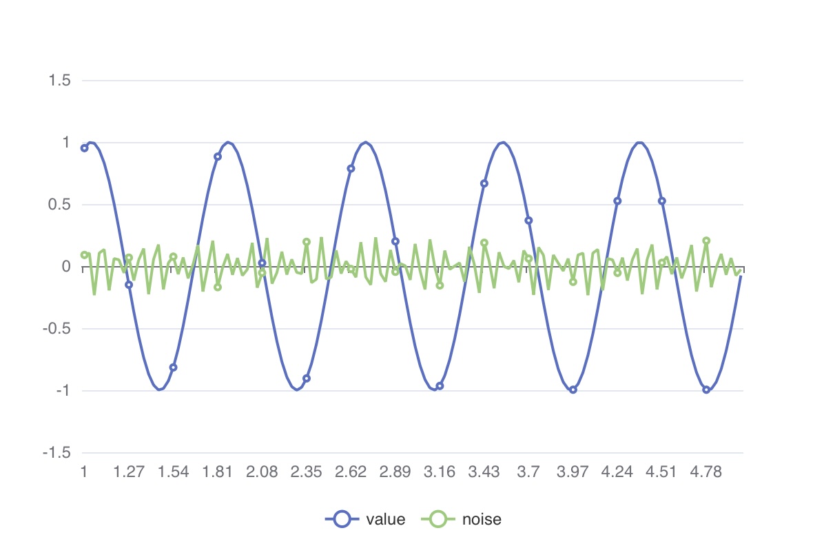
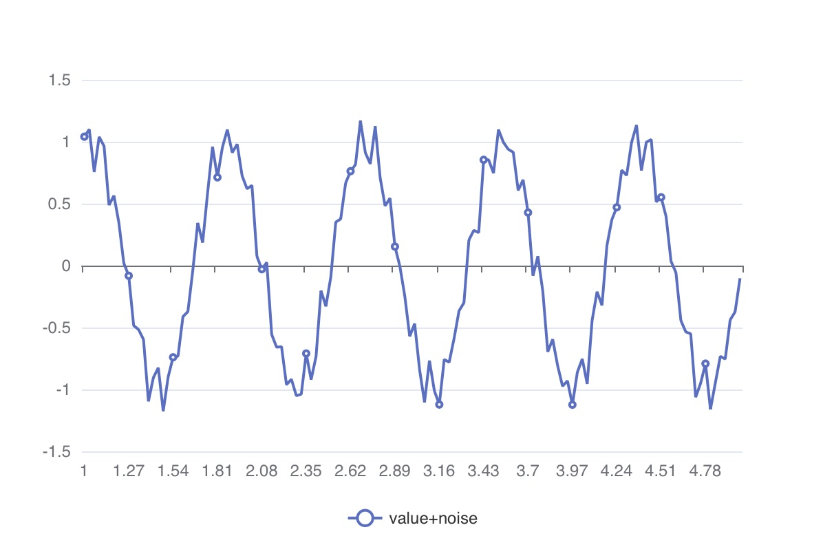
Ultimately, the values measured through sensors result in a graph like the one below, where noise is mixed in.
In databases, the stored values are a blend of the aforementioned noise, and during the data analysis process, we often desire to observe the data with some degree of noise removal (noise filtering).
Average
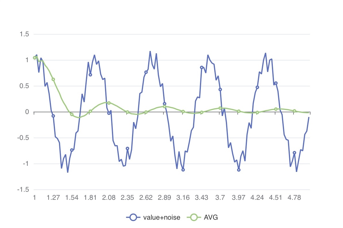
Imagine the zero-point calibration process for sensors. When we accumulate consecutive values and calculate their average, we can observe that the sine wave, as shown below, eventually converges to zero.
Moving Average
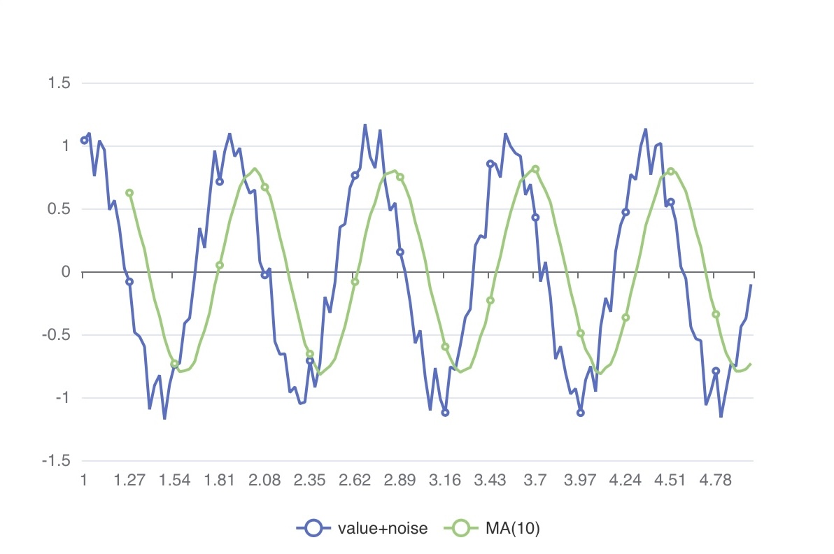
Instead of calculating the average for the entire accumulated sample, we use a fixed-size window of samples to compute the average. This concept aligns with the commonly seen moving average over a certain number of days in stock charts.
Low Pass Filter
While moving averages are convenient to use and understand, they have some limitations:
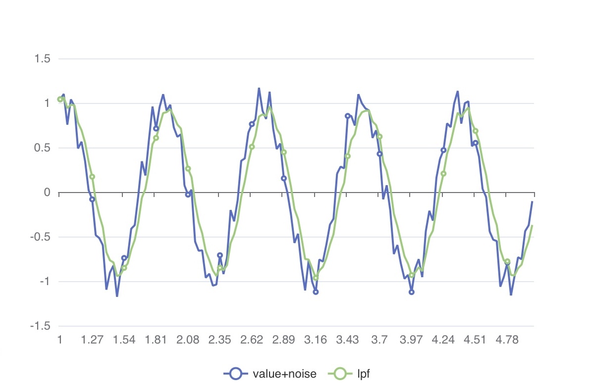
They tend to be slow in reflecting recent trends due to equal weighting applied to all samples within the window. They are less responsive to significant changes in values. To address this, a common practice is to apply different weights to the most recent and older values within the window when calculating the average.
Kalman Filter
The model() argument of the MAP_KALMAN() function takes input values representing mathematical system variables. Explaining how to determine optimal system values lies beyond the scope of this document.
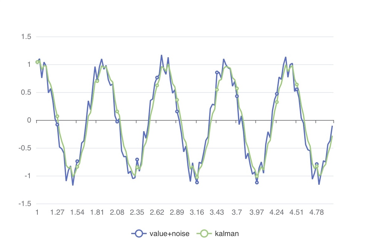
However, in practice, you can easily apply a simple Kalman filter model in TQL and iteratively find empirically optimal parameters.
The example below demonstrates how changing the model’s value affects the graph. Feel free to experiment with different model values and observe how the graph responds
